The Ultimate Guide to Conversational Form Design: Best Practices for Higher Conversions
In the digital age, forms are the bridge between your brand and your audience. Whether you are collecting leads, processing orders, or gathering user feedback, the design of your form directly impacts your conversion rate. Traditional online forms, which present a massive wall of fields and inputs, often feel like tax documents. They overwhelm users, trigger cognitive fatigue, and lead to high abandonment rates.
Enter conversational form design. By transforming a static form into an interactive, step-by-step dialogue, brands can significantly reduce form fatigue, boost response quality, and increase overall conversion rates. In this comprehensive guide, we will explore the psychology behind conversational forms, outline essential UX best practices, and demonstrate how to build forms that feel like a natural conversation.
Why Conversational Forms Outperform Traditional Layouts
To understand why conversational forms work, we must look at human communication. When humans meet, we do not hand each other a paper list of 20 questions to fill out in silence. We ask questions one by one, listen to the responses, and adjust our follow-up questions accordingly. Conversational forms replicate this dynamic. By showing only one or two fields at a time, you align with natural cognitive processing limits. This approach offers several core advantages:
- Reduced Cognitive Load: By breaking a long form into digestible steps, you prevent users from feeling overwhelmed by the sheer volume of fields.
- Improved Completion Rates: Studies show that multi-step, conversational forms can increase completion rates by 35% to 50% compared to traditional single-page forms.
- Better Mobile UX: Typing into tiny inputs on mobile screens is frustrating. Conversational designs, with large tap targets and responsive inputs, are optimized for thumb-driven interactions.
- Enhanced Focus: With only one question visible, users can focus entirely on providing an accurate answer, leading to cleaner data.
1. Start with a Warm, Welcoming Greeting
Every conversation begins with a greeting. Your forms should be no different. Instead of dropping users directly into the first input field, use a welcoming intro screen (often called a "welcome screen" or "hero card"). This screen sets the tone, explains why you are collecting information, and outlines how long the form will take to complete.
"A good welcome screen acts as a polite handshake, immediately building trust and setting clear expectations."
For example, instead of a title like "Lead Capture Form," use an inviting headline like "Let's build your custom quote. This will take about 2 minutes." Include a clear, action-oriented button like "Get Started" to nudge users forward.
2. Maintain a Friendly and Natural Tone
The copy in your form fields should read like a script for a friendly conversation. Rather than using robotic labels like "First Name:" or "Company Size:", frame them as questions or polite statements:
- Instead of "Name": Use "What's your name?"
- Instead of "Company Size": Use "How many people work in your team?"
- Instead of "Budget": Use "What budget range are you planning for this project?"
By personalizing the copy, you build a connection with the user, making them more willing to answer and engage honestly.
3. Implement Conditional Logic (Smart Branching)
A true conversation flows based on the answers given. If someone tells you they don't own a car, you wouldn't ask them what brand of tires they buy. Yet, traditional forms do this constantly, showing irrelevant fields to users and forcing them to skip them manually.
With conditional logic (also known as branching), your form adapts dynamically. If a user selects "Individual Plan" on step one, the form skips questions related to team onboarding and routes them directly to personal preferences. This makes the form shorter, more relevant, and vastly more professional.
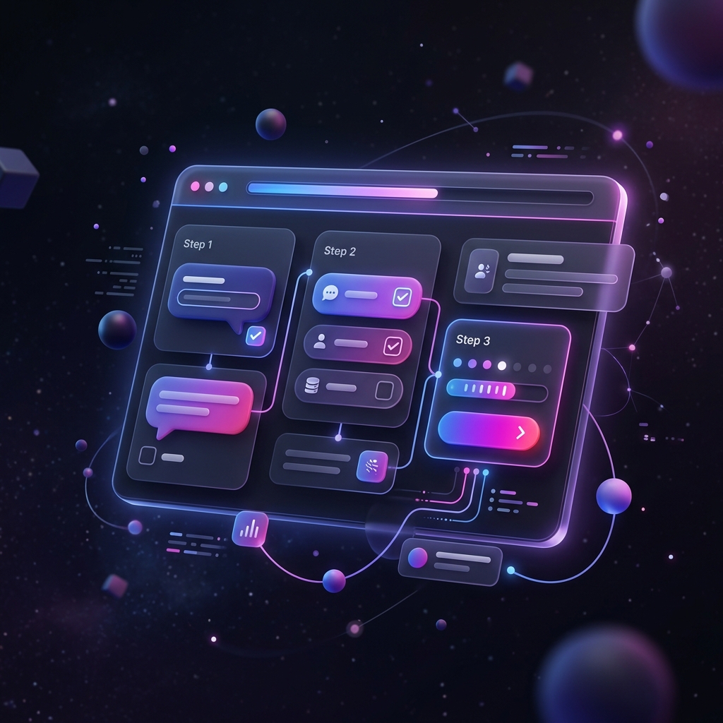
4. Provide Visual Feedback and Progress Indicators
When filling out a form, users want to know how far they have progressed and how much remains. A lack of progress indicators triggers frustration, prompting users to drop out. Always display a subtle, accurate progress bar at the top or bottom of your conversational form. Seeing a progress percentage increase with each completed step provides a small hit of dopamine, encouraging users to finish the sequence.
5. Keep the Inputs Clean and Accessible
Accessibility is a cornerstone of premium form design. Ensure your inputs, checkboxes, and buttons have high contrast, clear focus states, and are accessible via keyboard navigation. Use large tap targets (minimum 48px by 48px) for mobile users to prevent accidental taps. Leverage auto-formatting for inputs like phone numbers and credit cards to minimize input errors and user frustration.
Conclusion: The Future of Forms is Conversational
By adopting conversational design principles, you transform a mundane utility into an engaging brand experience. The key is to start small: convert your longest, lowest-converting form into a step-by-step conversational flow. Test, monitor the analytics, and watch your conversion rates rise. With AI-powered form builders like Formsyx, building conversational forms has never been faster or easier.